Case Study
Challenge
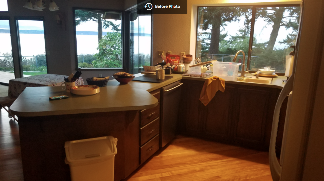
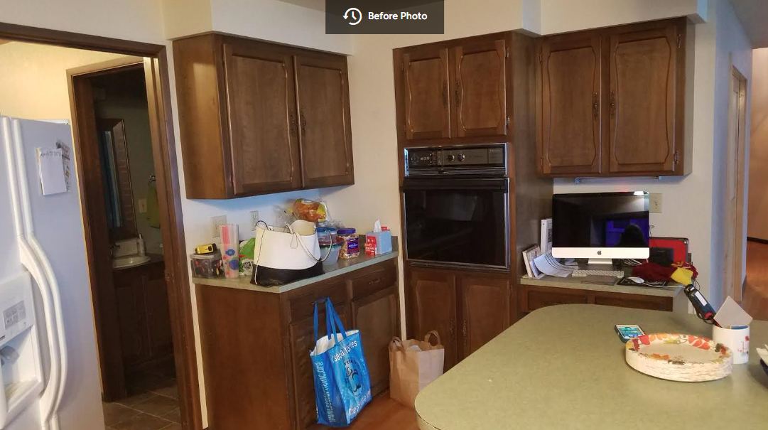
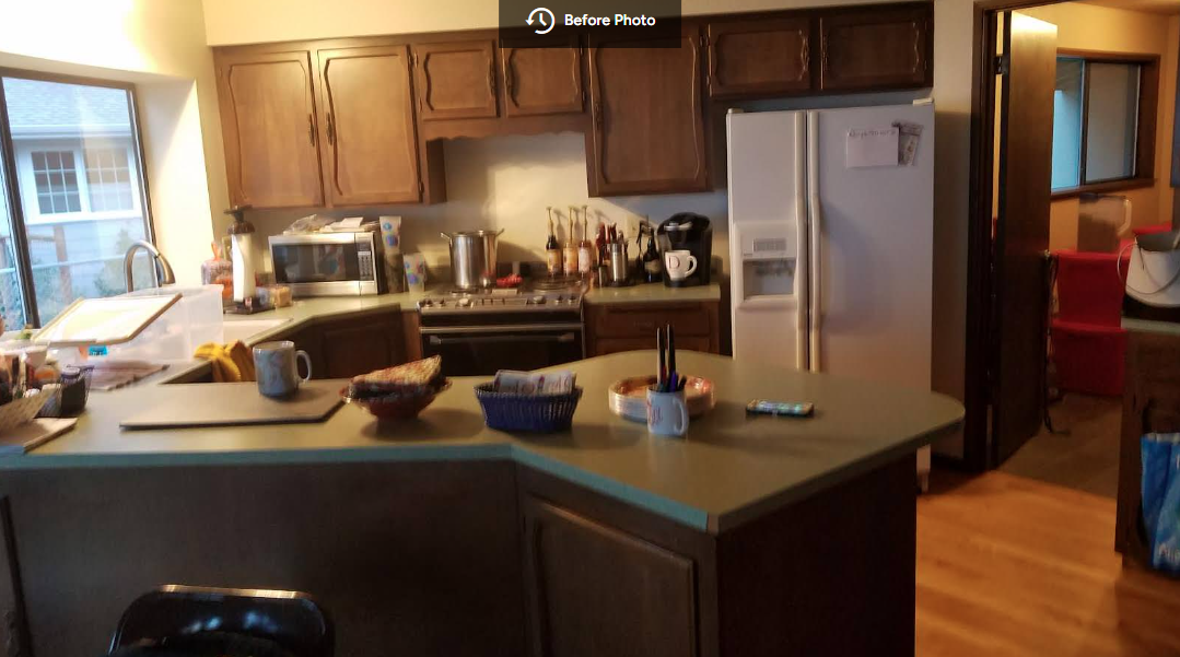
Reimagine the dark, dated kitchen to accent the beauty of this lovely, mid-century home. Find a natural design solution that accommodated the floor plan’s challenging angles.
Solution
Introduce texture and color to take better advantage of light from the large window. Replace the old, broken-down cabinets and delaminating countertops with a sleek new look. Alter the peninsula to make it more functional for food preparation.
Results
The simple Navy cabinets, pendant glass lights, and playful, scallop-patterned backsplash engage the senses by reflecting the blues of the nearby water, while the wall of white subway tile delineates the kitchen from the rest of the open area. This has the effect of drawing the eye up to the vaulted ceiling, which complements the house’s architecture instead of fighting it.
The once-dingy space is now alive with light and color, adding an exciting new dimension to this waterside home.


